Application Exercise 10g: Data analysis and use of excel

- Using Excel (or another spreadsheet program), create a bar chart showing the share of people living in poverty by state and territory between 2010 and 2020. When creating the chart, choose the ‘Clustered column’ option. This will allow you to represented the data for each year clustered with the state or territory. You can adjust the colours of each bar (column) to make your chart more readable.
- Analyse the data by completing the following:
- Describe the pattern of data overall – which state/territory had the highest and lowest levels of poverty over the period
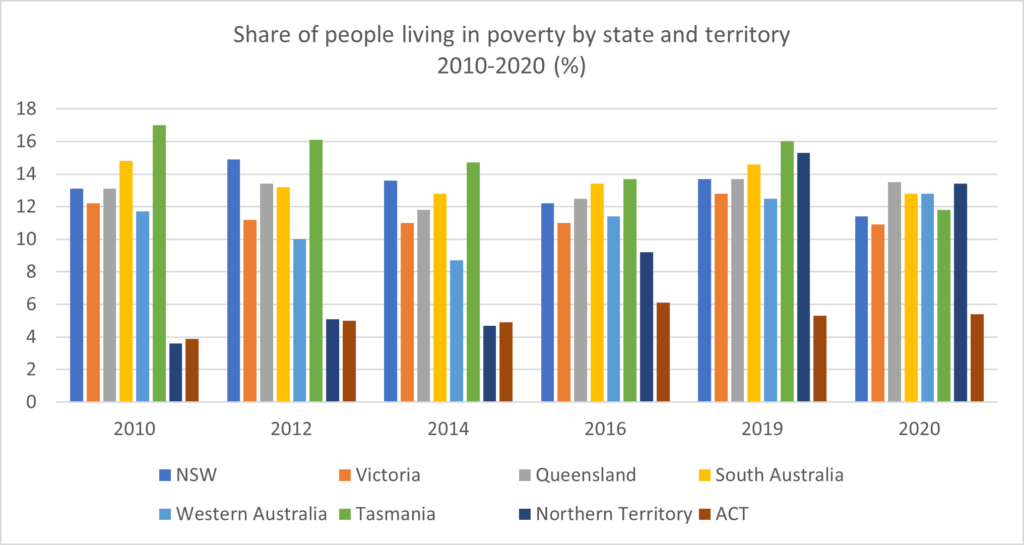
Tasmania had the highest level of poverty over the period on average – ranging from around 17% of people living in poverty in 2010 to just under 12% of people living in poverty in 2020. In all years except 2020, of all the states, Tasmania had the largest proportion of its population living in poverty.
The ACT consistently had the lowest proportion of its population living in poverty, ranging from as low as 3.9% in 2010, to as high as 6.1% in 2016, before falling to 5.4% in 2020.
Levels of poverty in NSW, Victoria, Queensland, S.A. and W.A. did not vary considerably, although there as an overall fall in percentages of the population living in poverty across ALL states and territories (apart from W.A.) between 2018 and 2020.
The most notable change was in the Northern Territory, which, as of 2010, had the lowest proportion of its population living in poverty. By 2019 it had risen to the second highest, only slightly lower than Tasmania. In 2020, 13.4% of all Northern Territorians lived in poverty.
- Consider and explain some possible reasons for the differences in poverty rates between states and territories
There are a number of possible reasons for differences in poverty rates between states and territories. One key reason may be varying average levels of education. Higher average rates of education often correlate with higher incomes on average, and lower rates of poverty. The nature of employment available in certain areas and the degree of urbanisation may also contribute to differing incidences of poverty across certain areas. As noted in the reading, living in remoter parts of Australia means lower average incomes and higher rates of unemployment. For example, Tasmania has lower average levels of education compared to many other states, whereas the ACT has higher levels of education and lower unemployment.
- Describe the changes in the pattern of data over the period shown – in which years did poverty rates rise and fall? By how much?
There is a very noticeable increase in the proportion of the population in the Northern Territory living in poverty between 2014 and 2016, then 2018 and 2020. Across Australia, poverty rates rose in 2019 – with the proportion of the population living in poverty rising by more than one percentage point in every state and territory, apart from the ACT. Across Australia, poverty rates fell noticeably in 2020 – which is discussed in the answer to part d. below.
- Consider and explain some reasons for the changes in poverty rates over time with a focus on the most recent data.
There was an overall fall in percentages of the population living in poverty across ALL states and territories (apart from W.A.) between 2018 and 2020. During 2020, the government introduced a number of substantial income supplements (in its economic response to the COVID-19 pandemic emergency and shutdown). These included JobKeeper – a direct payment to employees via employers, where an employer experienced (or expected to experience) a significant decline in revenue for the period. The second key increase to incomes was the effective doubling of the JobSeeker (unemployment) benefit, which would have lifted a large number of people out of poverty (since JobSeeker at its pre-COVID rate was below the poverty line for most recipients.)